At long last, I have more or less finished the cover painting for The King of Nightspore's Crown, and here it is:
It measures something like 12" x 9", painted on my trusty block of Arches hot-pressed, using a lot of Indian red. Other colors include burnt umber, cadmium red, gold ochre, Naples yellow, sap green, chrome green, cerulean blue, and French ultramarine. No black was used, as I find that it merely deadens the colors, but I have a lamentable weakness for Payne's gray (the only mixed color I use), and this contains some black pigment.
I started the picture in January and finished it today, working mostly late at night. There were about two months in there when I literally didn't have a single weekend to myself, due to various things that came up. A significant portion was painted while rocking a very light-sleeping baby with my foot, which takes a certain amount of coordination. What a life, what a life.
Anyway, on to other material elements. There's a bit of Henri Rousseau here, and also some Samuel Palmer. Like Palmer, I do love a good moon in a painting, especially a crescent moon.
I also looked at some book covers that I like, including one by Kinuko Craft for Perelandra and another by Leo and Diane Dillon for a novel by Ursula K. Le Guin.
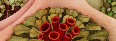
Another thing I really like are big murals of prehistoric life, like the ones at the Houston Museum of Natural History, or Zallinger's famous Age of Reptiles mural at Yale. My stories take place in a Paleozoic world, so this seems a fitting inspiration. Here we have a dimetrodon trying (and failing) to hide behind a stand of calamites.
Most of the plants are purely fantastic, however, in the sense that they have a place in neither geological antiquity nor my novel. I honestly just drew the shapes that pleased me, and colored them according to the same principles.
To paraphrase Winnie-the-Pooh, you just have to let things come in where they want. So the cover is more evocative than illustrative. I don't suppose any cover artist is in complete accord with the writer's ideas; I'm no different, even though I'm the same person.
As I've mentioned before, there are a lot of things to think about when making a wrap-around cover. In creating my festival of wrap-around cover art the other day, I began to surmise that much of it (the cover of Xiccarph, for instance) was trimmed down from pieces larger and more symmetrical. To produce a painting that will serve as a cover without serious cropping, you have to make sure that it falls naturally into three sections (front cover, spine, back cover) while remaining a unified whole (because you are a principled artiste who could do no less).
My spine, I think, is particularly successful:
There, wouldn't that look handsome on your bookshelf? Whether the other parts will come together remains to be seen. No doubt I'll have to tweak things a bit.
To get an idea of the truly glacial pace at which I paint, reflect that I worked through unabridged audiobooks of Titus Groan, The Bloody Crown of Conan, Dracula, King Solomon's Mines, Great Expectations, Bleak House, Imaro, Imaro 2, Nostromo, In a Glass Darkly, The Brothers Karamazov, and The House on the Borderland while in progress. That's not counting the time spent listening to Pink Floyd and the Doors.
I wanted very much to listen to Emma, which happens to be one of my favorite novels, but was afraid that Miss Woodhouse would make me lose my take-no-prisoners sword-and-sorcery mojo. I'm not joking about that. There's enough pink in the picture as it is.
Stay tuned for further developments in the publication of my upcoming novel.


No comments:
Post a Comment